La Cueva Agency
Branding & Multi-Service Creative Agency Website
Scope
Branding + Website Design
Role
End-to-end UX/UI Designer (Brand, Strategy, IA, UI Design)
La Cueva is a creative agency focused on:
-
Music production & artist management
-
Audiovisual production
-
Graphic design
-
Photography
-
Social media management
-
Consulting services
The agency lacked:
-
A defined visual identity
-
A clear service structure
-
A digital presence that positioned them as a professional creative partner
They needed a website that would:
-
Showcase their musical releases and artists
-
Present their creative services
-
Attract new clients
-
Establish credibility and brand consistency
The Challenge
The main challenge wasn’t just designing a website.
It was defining what La Cueva actually was.
They operated as:
-
A music label
-
A creative studio
-
A production company
-
A talent management agency
But they had no structured brand system or clear value proposition.
The problem:
How might we transform a multi-disciplinary creative collective into a clear, scalable digital brand that attracts both artists and corporate clients?
Goals
Business Goals
-
Increase inbound leads
-
Showcase portfolio projects
-
Expand beyond music into broader creative services
-
Build professional credibility
User Goals
-
Quickly understand what La Cueva does
-
Explore projects visually
-
Discover artists
-
Contact the agency easily
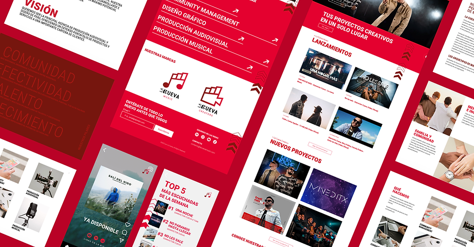
Brand Development
They had no consistent identity before.


Brand strategy decisions:
Positioning:
A bold, modern, creative agency rooted in music culture.
Tone:
Energetic, ambitious, creative, latin.
Visual Direction:
-
Strong red as primary brand color
-
High-contrast layouts
-
Bold typography
-
Large headlines
-
Editorial-style imagery
The red became a defining element — powerful, memorable, and aligned with music/creative industry energy.
Information Architecture
The agency offered many services that could easily feel chaotic.
I structured the website into clear pillars:
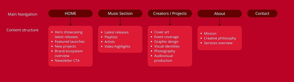
This structure separated:
-
Music (public-facing content)
-
Services (client-facing work)
That distinction was critical for clarity.
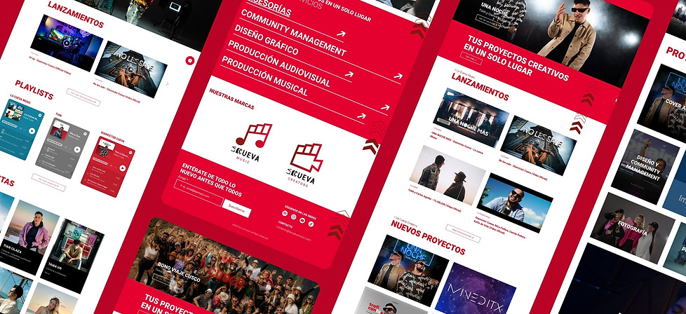
UX Decisions
1. Visual-first Layout
The creative industry is highly visual.
So the site prioritizes:
-
Large imagery
-
Project thumbnails
-
Clear content blocks
-
Minimal text overload
3. Strong Section Anchors
Every section has:
-
Large red headers
-
Clear segmentation
-
CTA buttons
-
This avoids scroll confusion and improves scanning.
2. Clear Categorization
Instead of mixing music and services randomly, I:
-
Grouped launches
-
Created dedicated project sections
-
Built strong section headers
4. Service Visibility
On the About page, services are presented clearly as different categories.
This helps corporate clients quickly identify relevant services.
UI System
Color System
-
Primary Red
-
White backgrounds
-
Black contrast blocks
-
Occasional dark sections for drama
Typography
-
Large uppercase headings
-
Clean sans-serif
-
Editorial spacing
Components Designed
-
Release cards
-
Project grid system
-
Artist profile cards
-
Newsletter module
-
Contact form
-
CTA buttons
-
Category labels
I created reusable visual modules to ensure scalability.
Results & Impact
The website helped La Cueva:
-
Present themselves as a structured agency
-
Clarify their service offering
-
Showcase both artists and commercial work
-
Establish a recognizable brand identity
It transformed them from an informal creative group into a positioned creative agency.